
How to Style our Mini Screen Prints
The Mini Screen Print Collection is a collection of colorful silkscreens that radiate personality, creativity, and playfulness. With twenty three different designs in varying colorways, there are endless possibilities of how to style the collection. When grouped together, the mini silkscreens feel curated and expressive, qualities that many people find attractive in interior design. Pairing different combinations together creates a visual collage on the wall- the pieces interact, making the overall composition on the wall become the artwork. We’ve collected examples of how different interior designers have used the collection over the years with their versatile size and bright color combinations.
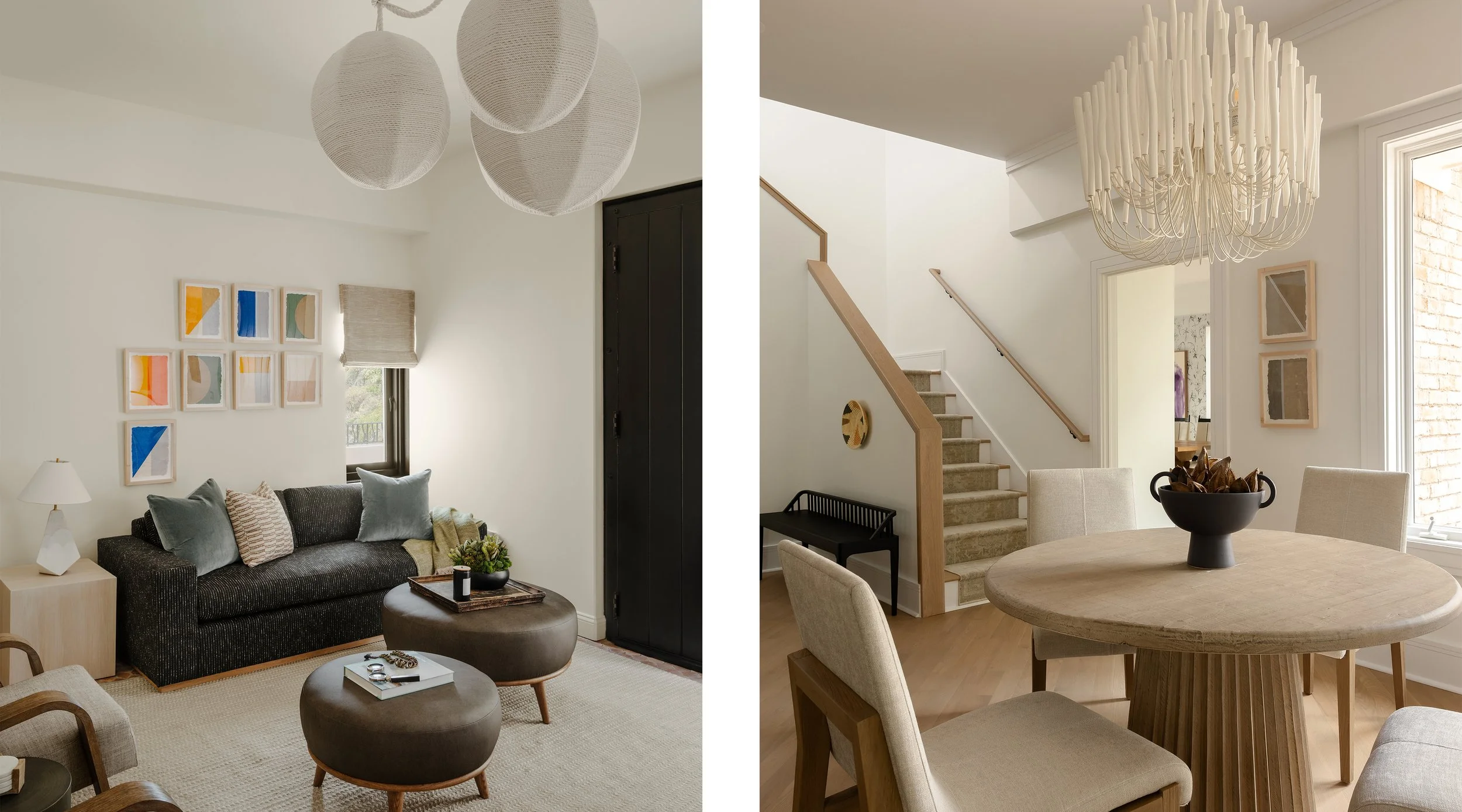
Morrison Interiors used a grouping of the Mini Screen Prints in a residential project. Hung above a sofa, they arranged the eight silkscreens in a unique way to have a more dynamic composition on the wall. The bright colors of the prints stand out in the neutral interior and add a playful touch to the space.
With a pair of two, CarolynLeona hung the grey Mini Screen Prints in a living room. Hung above one another, the prints fit perfectly on the thin wall between a doorway and window, visually filling the oddly shaped space. Their grey and silver tones complement the neutral tones of the room, giving a pop of graphic design to the area.
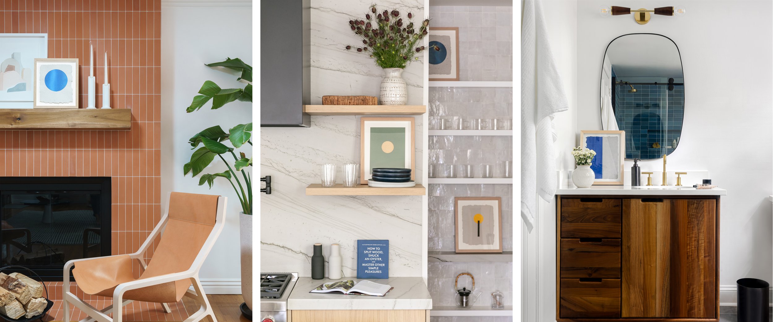
Many interior designers use the collection as accessories to style their spaces. With a framed 12” x 15” size, the Mini Screen Prints are perfect for sitting on a shelf or countertop. Ria Bravo Design added Mini Screen Print VII to the shelf above a mantle. Styled with another print and candlesticks, she creates depth by layering in the narrow space and the blue silkscreen contrasts with the orange tiles. Laura Brophy Interiors styled three Mini Screen Prints on shelves in a kitchen to add a pop of color. The prints provide the perfect backdrop to the homewares on the shelves and make a typically plain space more intriguing. CarolynLeona added Mini Screen Print XVII to the countertop in a bathroom. The bright blue ink complements the blue tiles in the shower, tying the space together.

In our Sage LA project, we hung a grid of twelve Mini Screen Prints in a music room. The vivid silkscreen inks stand out against the dark green wallpaper, making a bold statement, and the linear designs interact, connecting all the smaller artworks into one larger art piece.