VISUAL CONTRAST
X KATE LESTER
Introducing the Faces and Places Collection - A Special Collaboration with Kate Lester Home
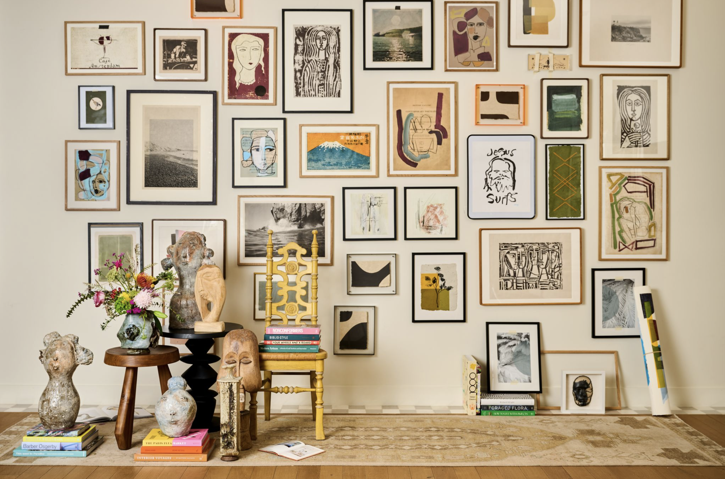
We’re thrilled to unveil the Faces and Places Collection, created in collaboration with the talented team at Kate Lester Home. Kate was the very first interior designer to purchase a silkscreen from Visual Contrast back in 2017 and she’s been a champion of our work ever since. Continually inspired by her bold and playful design aesthetic, this collection is a true celebration of our creative partnership. Blending Visual Contrast’s signature style with Kate’s eclectic eye for art, the Faces and Places Collection is available to view and purchase on the Kate Lester Home site.
Rooted in our shared Southern California surroundings, many of the “places” mentioned draw inspiration from the coast, featuring photography captured by VC photographers Bryce and Alex. We also expanded the concept to include our bold, typographic Matchbook prints referencing places like Japan and Amsterdam. The “faces” theme, inspired by Kate’s vintage art finds, brings a fresh and playful assortment to the collection. VC artist Erin created custom mixed media portraits on antique book pages, while Kate contributed striking black and white figurative block prints.
INSPIRATION


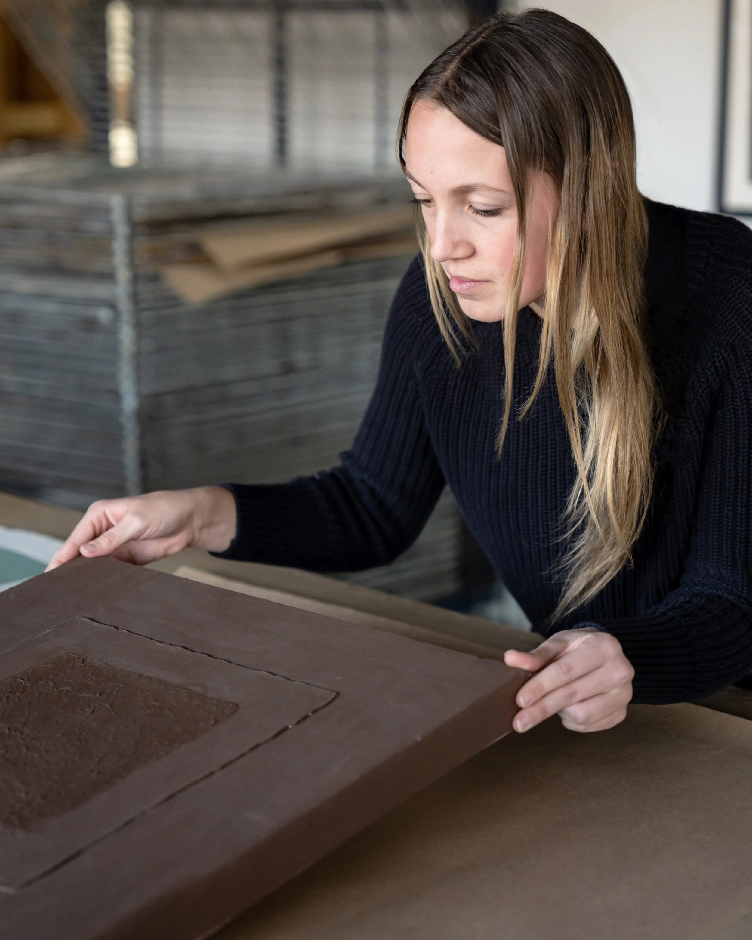
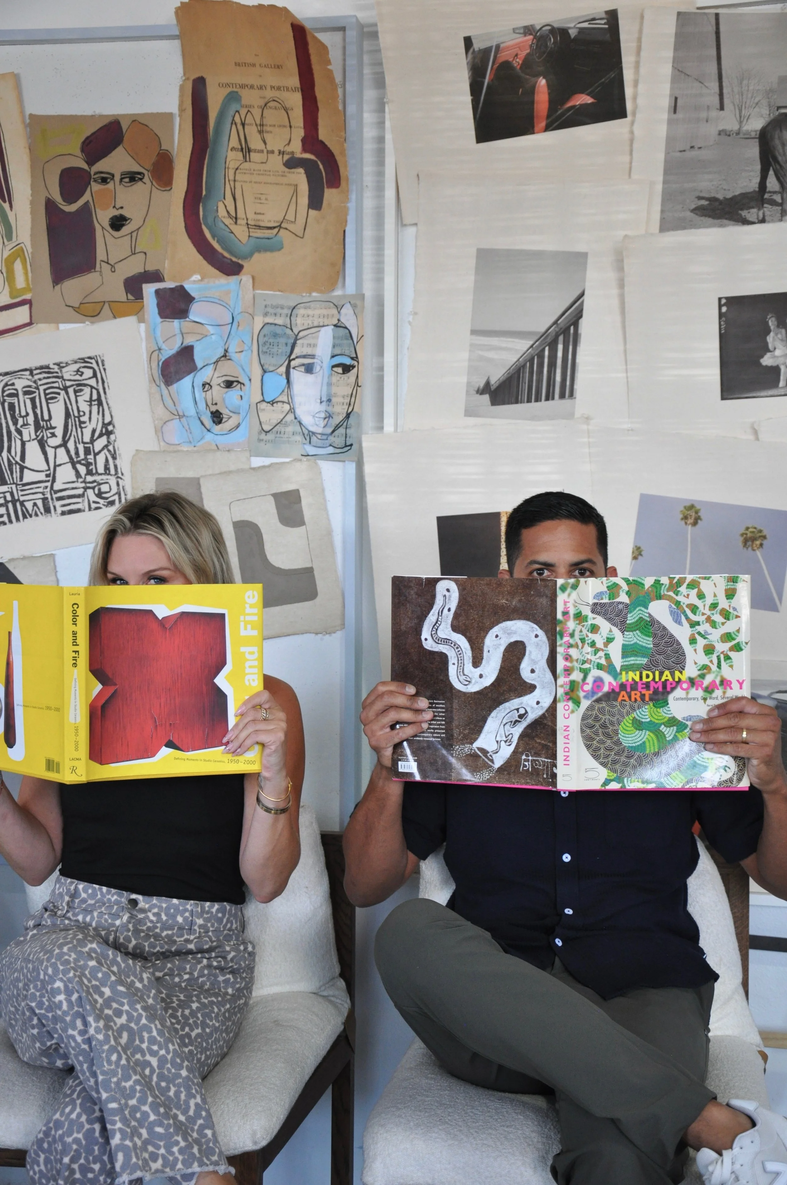
When we first sat down to brainstorm the collection, Kate arrived with a selection of vintage prints that became the foundation for the Faces and Places collection. We began piecing the collection together, drawing from our catalog and concept archives to find artworks that aligned with our shared vision. We also invited a few of our artists to create custom pieces inspired by the “faces and places” theme, while adapting existing concepts to align with the collection’s color story. After a few rounds of test printing and refinement, Kate returned to the studio for a final review and together we knew the collection was complete.
PROCESS